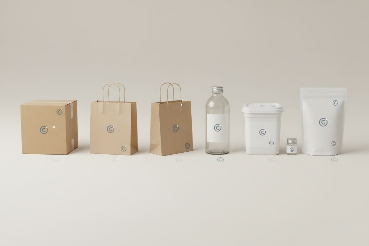
The placement of the logo on a box or any type of packaging is not merely an aesthetic decision. It is a strategic element that directly influences brand perception, visual recognition, customer experience, and product consistency both at the point of sale and during the unboxing process.
The essentials
- A well-executed design can lose impact if the logo is poorly positioned.
- Logos placed at the top or centre are usually perceived as more important.
- Placing the logo inside the packaging activates the reward effect by discovering the brand at the moment of highest emotional attention.
- The best position reinforces the brand message, adapts to the sales channel, improves user experience, and maintains visual consistency.
A well-executed design can lose impact if the logo is poorly positioned, while simple packaging can gain value if the brand appears in the right place. Therefore, deciding where to place the logo on the packaging is one of the keys to building a solid and recognizable brand.
Why the logo's position on packaging is so important
The logo fulfills several functions within the packaging:
- Identification Immediately identifies the brand.
- Positioning Reinforces positioning (premium, sustainable, creative, functional...).
- Guidance Guides the visual and user experience.
- Recall Improves brand recall and repeat purchases.
When the logo is well placed, it complements the design. When it is poorly placed, it competes with it.
Strategic Tool
The logo is more than just a graphic element; it is a strategic tool that communicates the brand's identity and values to the consumer.
The psychology behind logo placement and packaging design
Packaging design is not only perceived rationally but also emotionally. The logo's placement directly influences how a consumer interprets the product, even before touching it.
How the human eye reads packaging
In Western cultures, the eye follows a very specific visual pattern:
- From top to bottom
- From left to right
- First seeking the dominant element
Therefore, logos placed at the top or centre are usually perceived as more important and trustworthy, while those placed in secondary areas are interpreted as more discreet or exclusive.
Large logo vs. small logo: what each conveys
Large and visible logo
Conveys security, accessibility, and immediate recognition.
- Works well for young brands
- Good for e-commerce
- Ideal for mass consumer products
Small and well-integrated logo
Communicates exclusivity, control, and sophistication.
- Common in premium brands
- Used by luxury brands
- Suggests discretion
Size and placement work together to send a clear message without the need for words.
Clean packaging and white space
From a psychological point of view, white space:
- Increases the sense of quality
- Reduces visual stress
- Gives prominence to the logo without making it intrusive
A logo surrounded by space is perceived as more valuable than one surrounded by graphic elements.
The opening experience and the surprise effect
Placing the logo inside the packaging activates the so-called reward effect:
the consumer discovers the brand precisely at the moment of highest emotional attention.
This resource is especially effective in:
- Subscription boxes
- Gift packaging
- Brands that prioritize experience
For e-commerce and subscription services, consider placing your logo inside the box to create a memorable unboxing experience. This builds anticipation and amplifies brand recall.
Factors to consider before deciding where the logo goes
Product type
An e-commerce box is not designed the same way as a rigid case or food packaging.
Sales channel
- Retail: quick visibility on shelves
- E-commerce: impact on unboxing and photography
- Gift: emotional experience
Brand positioning
- Premium → discretion and balance
- Commercial → visibility and contrast
- Sustainable → natural integration
Box shape and size
Proportions directly influence logo perception.
The best locations for the logo on a box or packaging
- On the top face. The most common and effective option.
- On the inner lid. A strategic decision focused on experience.
- On the sides. Elegance and differentiation.
- On the front face. Key in retail.
- On the base or back. Subtle and exclusive branding.
1. On the top face
The most common and effective option.
Advantages:
- First visual impact
- Ideal for e-commerce
- Works very well in photographs
2. On the inner lid
A strategic decision focused on experience.
Advantages:
- Reinforces unboxing
- Allows for more minimalist exteriors
- Increases brand recall
3. On the sides
Elegance and differentiation.
Advantages:
- Cleaner design
- Good legibility on shelves
- Ideal for brands with a strong identity
4. On the front face
Key in retail.
Advantages:
- Immediate identification
- Facilitates purchase decision
- Greater visual impact
5. On the base or back
Subtle and exclusive branding.
Advantages:
- Premium feel
- Ideal for limited editions
- Less visual clutter