Packaging not only protects a product or makes it visually appealing; it is the first physical and emotional interaction a customer has with a brand. Therefore, designing packaging that anyone can use, regardless of their physical, cognitive, or sensory abilities, is not just an inclusive gesture: it is a smart business strategy. We are talking about inclusive packaging, a design approach that combines accessibility, functionality, and aesthetics to ensure all users enjoy the experience of opening and using a product.
The essentials
- Inclusive packaging allows anyone to interact with the product comfortably, safely, and efficiently, regardless of their physical, visual, or cognitive limitations.
- It addresses needs related to reduced mobility or limited strength, visual impairment, and cognitive impairment or comprehension difficulties.
- Key benefits include greater accessibility, improved customer experience, a stronger brand image, compliance with regulations, and differentiation from the competition.
In this article, we will explore what inclusive packaging is, why it is important, the types of needs it can cover, practical examples, and recommendations for implementing it in your products, especially in the context of brands like Sincla.
What is inclusive packaging?
Inclusive packaging is designed to allow anyone to interact with the product comfortably, safely, and efficiently, regardless of their physical, visual, or cognitive limitations.
It is not just about complying with accessibility regulations, but about improving the customer experience and reflecting values of empathy and social responsibility. For example, easy-to-open packaging with clear instructions and intuitive visual elements can make the difference between a satisfied customer who repeats a purchase and a frustrated one who abandons the brand.
Core Principles
Inclusive packaging focuses on accessibility, functionality, and aesthetics to ensure universal usability of products.
Inclusive packaging covers three main areas:
- Reduced mobility or limited strength
- Visual impairment
- Cognitive impairment or comprehension difficulties
1. Packaging for people with reduced mobility or limited strength
Many people face difficulties opening packaging due to arthritis, hand injuries, or simply lack of strength. This is where inclusive design can make a big difference.
Practical examples:
- “Push-open” cap or with easy-open button Water bottles, cosmetic jars, or food containers that open with a single gesture, without needing to twist or apply force.
- Ergonomic handles and lightweight packaging Shipping boxes or heavy product containers designed with integrated handles and a shape that fits the hand, reducing effort when lifting or carrying.
- Non-slip textures Lids or rough surfaces that allow a secure grip even with wet or slippery hands.
Sincla practical case:
Imagine a personal care set. Instead of jars with conventional lids, the packaging can include lids with relief and a press mechanism that anyone can open effortlessly. Additionally, external boxes can have ergonomic handles that facilitate handling, improving the shopping and delivery experience.
2. Packaging for people with visual impairment
Inclusive design is not limited to physical strength: it also includes those who have difficulty seeing or reading small labels. According to the World Health Organization, more than 200 million people worldwide have some visual impairment, so this aspect of inclusive packaging has a great impact.
Over 200 million people worldwide have some form of visual impairment, highlighting the broad relevance of accessible packaging features.
Practical examples:
-
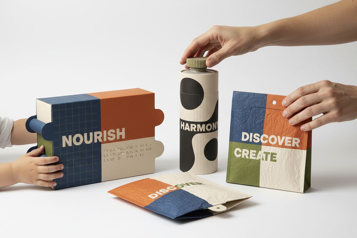
High-contrast labels and large typography:
Ingredients, usage instructions, or nutritional information written in clear letters, with colours that contrast with the background. -
Braille or tactile pictograms:
Include essential information in Braille, such as ingredients, expiry date, or opening instructions. -
Differentiating textures:
Tactile surfaces to easily identify different products within a set or pack.
Sincla practical case:
A gourmet product pack can have labels with large typography and strong contrasts, as well as small tactile pictograms indicating the type of product (sweet, savoury, drink). This allows any customer to quickly and safely identify the product, without relying solely on sight.