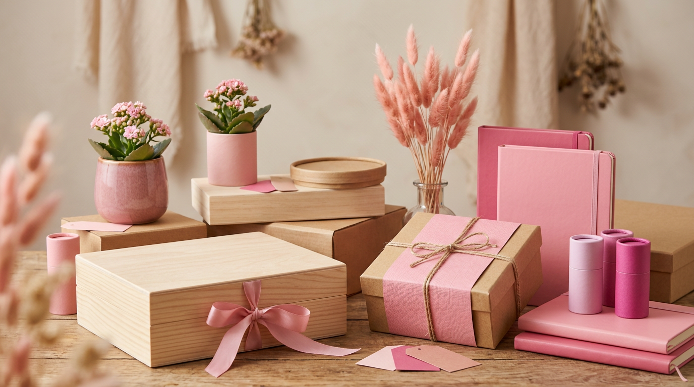
The fascination with pink: a color with multiple dimensions in packaging and beyond
pink itemsThe essentials
- Pink evokes diverse emotions, from tenderness to sophistication, depending on its shade.
- Its use in packaging is strategic for communicating values such as sweetness, luxury, or ecology.
- The choice of material and finish enhances the message of the color pink in boxes and packaging.
The psychology of the color pink: beyond stereotypes
Color range
Pink ranges from pale `dusty pink` or `powder pink`, which convey calm and delicacy, to vibrant `fuchsia pink` or `magenta`, which exude boldness and modernity. `Salmon pink` or `coral` add a touch of warmth and vitality.
- Sweetness and tenderness: Ideal for children's products or edibles like chocolates and sweets.
- Love and romance: Widely used in gifts, weddings, and cosmetics.
- Calm and serenity: Pastel shades can be relaxing and inviting.
- Sophistication and luxury: More intense or metallic pinks, often combined with gold or silver, denote exclusivity.
- Innovation and modernity: Neon pink or fuchsia is used for avant-garde and youthful brands.
- Sustainability: Certain earthy or pale pink tones, especially on recycled materials, suggest ecological awareness.
Pink in packaging: a powerful visual strategy
Pink itemsMaterials that enhance pink
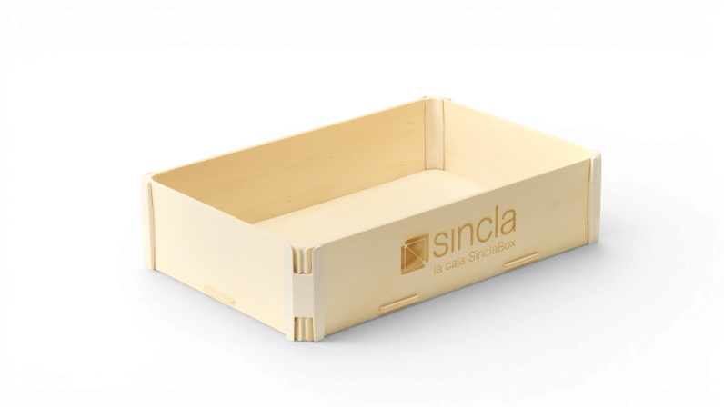
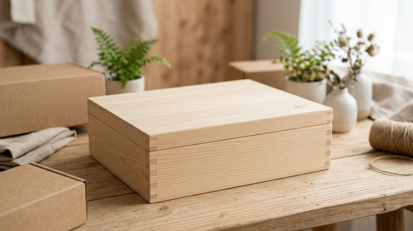
- Wood: On wooden boxes, a pink finish can be paint, tinted varnish, or even lined paper. In pastel tones, wood can convey rustic luxury; in intense tones, a modern and bold touch.
- Kraft cardboard: Pink applied on natural kraft acquires an organic and recyclable quality, very popular for ecological or artisanal products. The contrast between the brown of the kraft and the pink creates a unique aesthetic.
- MDF and plywood: These materials, being smoother and more uniform, allow pink to appear purer and more vibrant, ideal for lacquered finishes or high-quality printed papers.
- Paper and cardstock: Allow for a wide range of shades and finishes (matte, glossy, textured), forming the basis for most premium packaging.
Finishes and customization to enhance pink
Effective Combinations
Pink combines wonderfully with gold, silver, and copper for an opulent look. For a fresh contrast, mix it with mint tones or light blues. White and gray provide a modern and minimalist balance.
- Digital Printing or Silkscreen: Allows reproducing logos and designs directly on the pink surface of the box, offering great detail and saturation.
- Laser Engraving: On wood or cardboard, engraving creates a tactile and visual contrast, revealing the natural color of the material beneath the pink. It is ideal for an artisanal and high-quality touch.
- Hot Stamping: The application of metallic foils (gold, silver, copper, metallic pink) on a pink surface adds a shiny and luxurious effect, highly valued in premium packaging.
- Pad Printing: Suitable for irregular or small surfaces, it allows printing fine and precise details in the desired pink color.
- Embossing or Debossing: Manipulating the surface to create textures or three-dimensional designs on a pink box provides a tactile experience and added value.
- Special Finishes: Selective varnishes, UV, matte or glossy laminates can alter the perception of pink, adding depth and protection.
Pink Details
Not only the entire box can be pink. Elements like ribbons, interior linings, tissue paper, labels, or even hardware can introduce the color pink for a subtle and elegant effect, keeping the box a neutral color.
Applications of pink in the packaging and gift sector
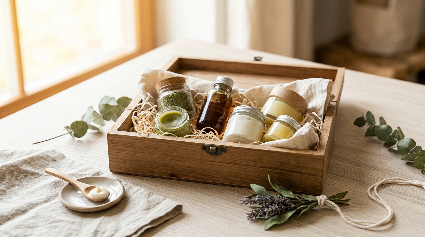
Packaging for beauty and cosmetic products
Packaging for food and confectionery
chocolate boxPremium gift boxes
Wooden boxesWedding boxescommunion boxesChildren's products and toys
Fashion brands and accessories
Considerations when choosing pink for packaging
Demographic target
Brand message
Current trends
Sustainability
pink itemsCommon Mistakes
Avoiding visual overload, using shades that clash with the product's message, or ignoring specific cultural associations of pink in certain markets are key for successful design.